I’ve been writing software for Decker for about 4 years. During that time I’ve experimented a bit with what what works for having a display constantly in my line of sight.
Rule 1: Make it Useful First
People (including yours truly) will put up with bad UX if the program solves a need. But useless software never gets run.
There are whole books to be written about how to write useful software, but one good technique is to start from a problem. Don’t start from pie-in-the-sky ideas, just because they’re cool. e.g. Automatically loading Wikipedia entries for nearby points of interest. That’s cool tech, but it doesn’t really solve a problem (unless you’re a tour guide with a terrible memory).
The difference between cool tech and useful tech can be hard to detect when you’re excited about a project. And to be sure, working on cool tech can be its own reward! But if you want to make something that’s going to become part of your daily life, think about the problems you’d like to have solved first and work backward from that.
For example, I like to collect board games. But I’m also cheap, so I tend to buy many board games secondhand from Goodwill. One of the challenges this poses is that I’ll come across games that I’ve never heard of, but look promising. I frequently pull out my phone to search Boardgame Geek (BGG) to get reviews and other information about the game. If I add a barcode scanner to Decker, I could automatically load BGG reviews after scanning the box.
And to be fair, this isn’t a big problem. It’s just a little bit of friction to pull out my phone and type in BGG <board game> into the search bar. But it’s still an example of a problem I could solve with a program that accepts barcodes.
Rule 2: No Flashing, Blinking, or Distracting Notifications
This piece of technology is literally in my face around the clock. It shouldn’t be a distraction from the real life that’s going on in front of me. Refreshes of the UI are fine, but it should never be competing for my attention.
In Todor, this is exemplified in how “alerts” work. Todor displays a combined view of my calendar and todo list to help me keep track of my responsibilities for the day. As tracked events come due, they need to tell me that time is running out - so how we do this without being distracting?
Data is better than notification.
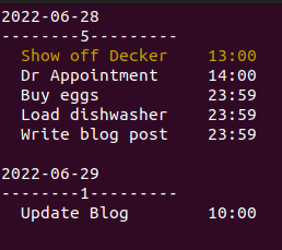
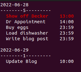
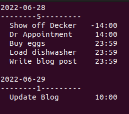
Instead of blinking, flashing, popping into my face or any of the other myriad methods of actively capturing attention, Todor highlights the important data… and then trusts I will notice when I have time. It does this through the use of color cues. As the event becomes more imminent, the alert mode changes.
Ten minutes before an event:

Three minutes before:

Ongoing event:
 (Note that the time shown now displays the end time of the event)
None of these alert types make any attempt to actively capture my attention. Instead, Todor highlights upcoming events and waits for me to notice (or not) on my own.
Rule 3: No Tracking - of Me or Anyone Else
If I’m going to be wearing a a computer that’s on 24/7, there’s a terrible temptation to add a camera and microphone.
- Voice-activated commands!
- Auto-Picture capture for live-blogging or auto-journaling!
- Facial recognition to remind me who someone is!
…No.
Society may be slowly losing privacy, but I don’t have to contribute to that. So no automatic recording or potential surveillance functions for me.
Rule 4: Minimize Required Input
Typing on a tiny keyboard is definitely a pain point. Keyboard shortcuts and quick input are the order of the day.
This is something I’ve learned the hard way by making Todor a bad example of this. Instead of something quick like CTRL+R, I made myself type out ‘refresh’.
Adding new events is similarly verbose:
add [todo|calendar] [Project name] <todo description>
Waaay too much text to type in with my thumbs.
Future updates will make use of keyboard shortcuts, modal input and so forth to minimize the amount of direct input required.